Reach your best customers using data
Written by: Barry Danielson, Vice President, Decision Sciences; Neil Helgeson, Director, Insights Lab
(View Author Bio)
Revenue growth is always critical, and in 2024 it’s pivotal in the B2B space. B2B companies are constantly looking for ways to generate more revenue and attract new customers, but where should growth efforts be focused? One approach is to look at your best customers and try to replicate them in order to maximize your time and resources.
But who are your best customers?

B2B businesses often categorize their customer base by size, frequently in terms of revenue. The small, medium and large categories highlight the top customers but don’t provide much insight into how to engage with them to drive growth or how to grow other customer segments. A better segmentation option that gives more detail, shows where customers are and suggests paths for growth is RFM segmentation.
RFM stands for Recency, Frequency and Monetary Value. These are categories of key performance indicators that help understand customers better. “Recency” is about how long it’s been since a customer interacted with the business – for example, making a purchase. “Frequency” is how often these interactions occur over a certain period of time. And “monetary value” is about how much a customer spends either per transaction or in total.
The nice thing about these categories is they’re not rigid. Each can be tweaked to suit a business’s unique needs. The way they are divided can vary as well. For example, dividing each category into thirds creates 27 possible customer categories. Increasing the divisions makes more categories, but that can get a little complex.
Here’s an example that makes this easier to digest. Imagine you’re analyzing sales transactions from the past three years. You’ve grouped your customers based on how recent their last purchase was, how many purchases they made in that period and the total value of their purchases. These groups are then split into top, middle and bottom thirds. That’s a lot of categories that can get confusing.
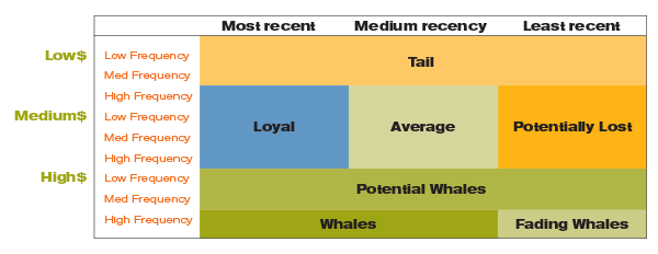
In a real-world case, these 27 categories were merged into seven broad segments because that was meaningful for that business. The key is to combine categories in a way that’s the most insightful for your business but also give a more nuanced view of customers, allowing you to tailor engagement strategies to each segment to optimize growth.

When you look at the chart, you’re probably thinking, “What do all of these segments actually mean?” Whales are your best customers. They have shown that they’ll pay, so they’re more likely to respond to a loyalty program that keeps them coming back. Fading whales used to be some of your best customers, but they haven’t purchased recently. A loyalty program with a promotion to encourage their past purchasing habits would be appropriate for this group. Potential whales are those who are spending money but not as frequently. A frequency-based promotion would be effective with this group.
Loyalists are recent customers that haven’t spent much yet. They would most benefit from a volume-based promotion to boost their spending. Average is those who have a modest spend, a range of frequency and limited recency. They’re the group who would most likely respond to promotions. And potentially lost are those who haven’t purchased much or very recently. They might be lost, but promotions targeted at products they’ve purchased in the past could refresh their purchasing.
Finally, tails are those customers who are probably lost. They haven’t spent much, and they don’t spend frequently. They don’t usually respond to promotions, and they produce minimal revenue. This is the group that shouldn’t be a focus of marketing efforts.
This is an example that only uses transactional data. Imagine how deep you could go with customer data. More in-depth profiles could be created that would allow you to generate more tailored engagement tactics.
____________________
RFM segmentation shows that, even with minimal information, useful strategic customer segmentation is possible to help direct your marketing efforts and drive revenue growth. By adopting this model, businesses can move beyond traditional size-based categories to a deeper understanding of their customers. From loyalty programs to specific promotions, implementing tailored tactics for each segment can significantly enhance customer relationships and optimize revenue.
____________________
The best way to get started is to get in touch.


